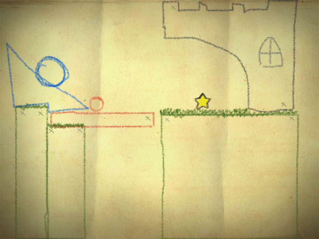
I like the idea - I actually had my screen colours inverted completely for some days. However... Looking at one white on black site for a while and then back at the usual black on white causes some uncomfortable afterimages for me, and while I like spending some time here I usually have Matlab/Mathematica/etc. on my screen and don't like to be distracted by funny colourful spots (that's also why I stopped using inverted colours, it didn't work on remote sessions). Maybe that's just me though... This could also interfere with accessibility issues, I'm afraid. But actually I like the style if you just invert the colours: [![Inverted style][1]][1] Amplifying the background a bit wouldn't hurt, too IMHO. I also like the sketchy style and colour choice of e.g. [Crayon Physics ](http://www.crayonphysics.com/) but that's probably giving the wrong idea to someone with "advanced" questions... [1]: https://i.sstatic.net/rFXZQ.jpg