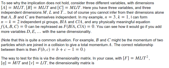
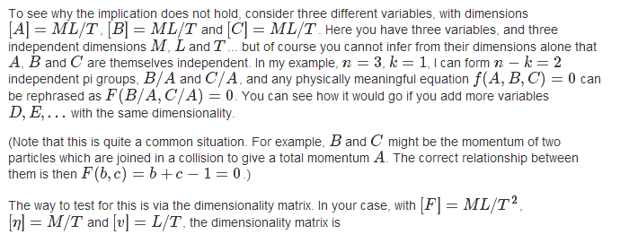
I haven't had time to go through enough questions to make up my mind on whether I'm OK with this aspect of the new design or whether I think we should go full blast and change to a serif font, but I do want to note that the problem is at least much better than it used to be - and give credit to the design team for addressing this. Compare the same [example](http://physics.stackexchange.com/questions/184087/buckingham-pi-theorem-application-the-case-of-only-0-or-1-dimensionless-grou/184099#184099) I used in [the original request](http://meta.physics.stackexchange.com/questions/6790/can-we-have-a-font-which-harmonizes-better-with-mathjax), with the new fonts vs the old ones. >###New CSS > --- >###Old CSS > In the old fonts, the LaTeX tends to stick out like a sore thumb, but it definitely blends in a lot better with the new ones. I'm holding judgement on whether it's enough or not for the moment, though.