Commonmark migration
Source Link

I haven't had time to go through enough questions to make up my mind on whether I'm OK with this aspect of the new design or whether I think we should go full blast and change to a serif font, but I do want to note that the problem is at least much better than it used to be - and give credit to the design team for addressing this.

Compare the same example I used in the original request, with the new fonts vs the old ones.

New CSS

###New CSS New CSS


Old CSS

###Old CSS Old CSS

In the old fonts, the LaTeX tends to stick out like a sore thumb, but it definitely blends in a lot better with the new ones. I'm holding judgement on whether it's enough or not for the moment, though.


###Added:

Added:

And indeed, things are not quite there yet, particularly with comments: consider for example
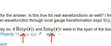
seen here, and obviously suffering from Sore Thumb syndrome. (Running chrome v48 over ubuntu, MathJax 2.6 with local STIX fonts, in case it's needed. It would be good to hear from others whether it displays this badly in other systems.)

Similarly, for that same comment, it appears that Firefox (v41 over Windows 7, MathJax 2.6 using web TEX fonts) produces this horrifying sight:

I haven't had time to go through enough questions to make up my mind on whether I'm OK with this aspect of the new design or whether I think we should go full blast and change to a serif font, but I do want to note that the problem is at least much better than it used to be - and give credit to the design team for addressing this.

Compare the same example I used in the original request, with the new fonts vs the old ones.

###New CSS New CSS


###Old CSS Old CSS

In the old fonts, the LaTeX tends to stick out like a sore thumb, but it definitely blends in a lot better with the new ones. I'm holding judgement on whether it's enough or not for the moment, though.


###Added:

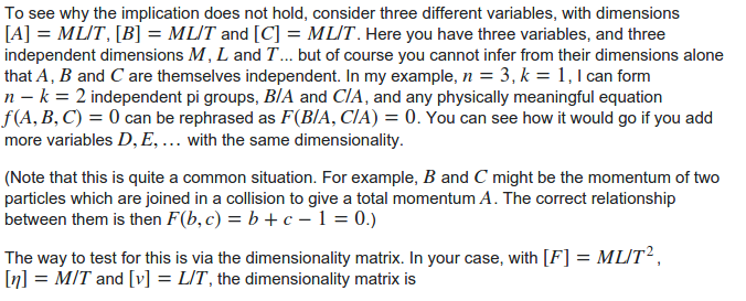
And indeed, things are not quite there yet, particularly with comments: consider for example

seen here, and obviously suffering from Sore Thumb syndrome. (Running chrome v48 over ubuntu, MathJax 2.6 with local STIX fonts, in case it's needed. It would be good to hear from others whether it displays this badly in other systems.)

Similarly, for that same comment, it appears that Firefox (v41 over Windows 7, MathJax 2.6 using web TEX fonts) produces this horrifying sight:
I haven't had time to go through enough questions to make up my mind on whether I'm OK with this aspect of the new design or whether I think we should go full blast and change to a serif font, but I do want to note that the problem is at least much better than it used to be - and give credit to the design team for addressing this.

Compare the same example I used in the original request, with the new fonts vs the old ones.

New CSS

New CSS


Old CSS

Old CSS

In the old fonts, the LaTeX tends to stick out like a sore thumb, but it definitely blends in a lot better with the new ones. I'm holding judgement on whether it's enough or not for the moment, though.


Added:

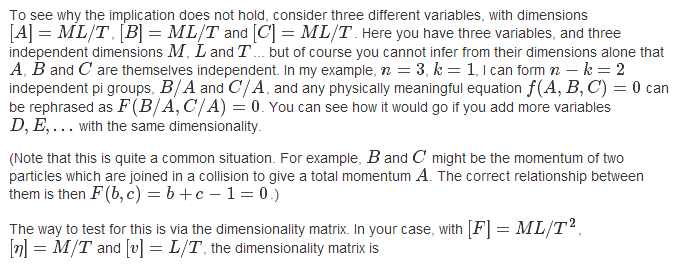
And indeed, things are not quite there yet, particularly with comments: consider for example

seen here, and obviously suffering from Sore Thumb syndrome. (Running chrome v48 over ubuntu, MathJax 2.6 with local STIX fonts, in case it's needed. It would be good to hear from others whether it displays this badly in other systems.)

Similarly, for that same comment, it appears that Firefox (v41 over Windows 7, MathJax 2.6 using web TEX fonts) produces this horrifying sight:
replaced http://physics.stackexchange.com/ with https://physics.stackexchange.com/
Source Link

I haven't had time to go through enough questions to make up my mind on whether I'm OK with this aspect of the new design or whether I think we should go full blast and change to a serif font, but I do want to note that the problem is at least much better than it used to be - and give credit to the design team for addressing this.

Compare the same exampleexample I used in the original request, with the new fonts vs the old ones.

###New CSS New CSS


###Old CSS Old CSS

In the old fonts, the LaTeX tends to stick out like a sore thumb, but it definitely blends in a lot better with the new ones. I'm holding judgement on whether it's enough or not for the moment, though.


###Added:

And indeed, things are not quite there yet, particularly with comments: consider for example

seen herehere, and obviously suffering from Sore Thumb syndrome. (Running chrome v48 over ubuntu, MathJax 2.6 with local STIX fonts, in case it's needed. It would be good to hear from others whether it displays this badly in other systems.)

Similarly, for that same comment, it appears that Firefox (v41 over Windows 7, MathJax 2.6 using web TEX fonts) produces this horrifying sight:

I haven't had time to go through enough questions to make up my mind on whether I'm OK with this aspect of the new design or whether I think we should go full blast and change to a serif font, but I do want to note that the problem is at least much better than it used to be - and give credit to the design team for addressing this.

Compare the same example I used in the original request, with the new fonts vs the old ones.

###New CSS New CSS


###Old CSS Old CSS

In the old fonts, the LaTeX tends to stick out like a sore thumb, but it definitely blends in a lot better with the new ones. I'm holding judgement on whether it's enough or not for the moment, though.


###Added:

And indeed, things are not quite there yet, particularly with comments: consider for example

seen here, and obviously suffering from Sore Thumb syndrome. (Running chrome v48 over ubuntu, MathJax 2.6 with local STIX fonts, in case it's needed. It would be good to hear from others whether it displays this badly in other systems.)

Similarly, for that same comment, it appears that Firefox (v41 over Windows 7, MathJax 2.6 using web TEX fonts) produces this horrifying sight:

replaced http://meta.physics.stackexchange.com/ with https://physics.meta.stackexchange.com/
Source Link
replaced http://meta.physics.stackexchange.com/ with https://physics.meta.stackexchange.com/
Source Link
Loading
replaced http://meta.physics.stackexchange.com/ with https://physics.meta.stackexchange.com/
Source Link
Loading
added 190 characters in body
Source Link
Emilio Pisanty
  • 135.4k
  • 2
  • 73
  • 213
Loading
added 273 characters in body
Source Link
Emilio Pisanty
  • 135.4k
  • 2
  • 73
  • 213
Loading
Source Link
Emilio Pisanty
  • 135.4k
  • 2
  • 73
  • 213
Loading