22
$\begingroup$

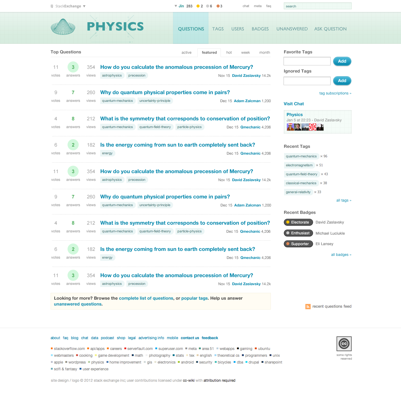
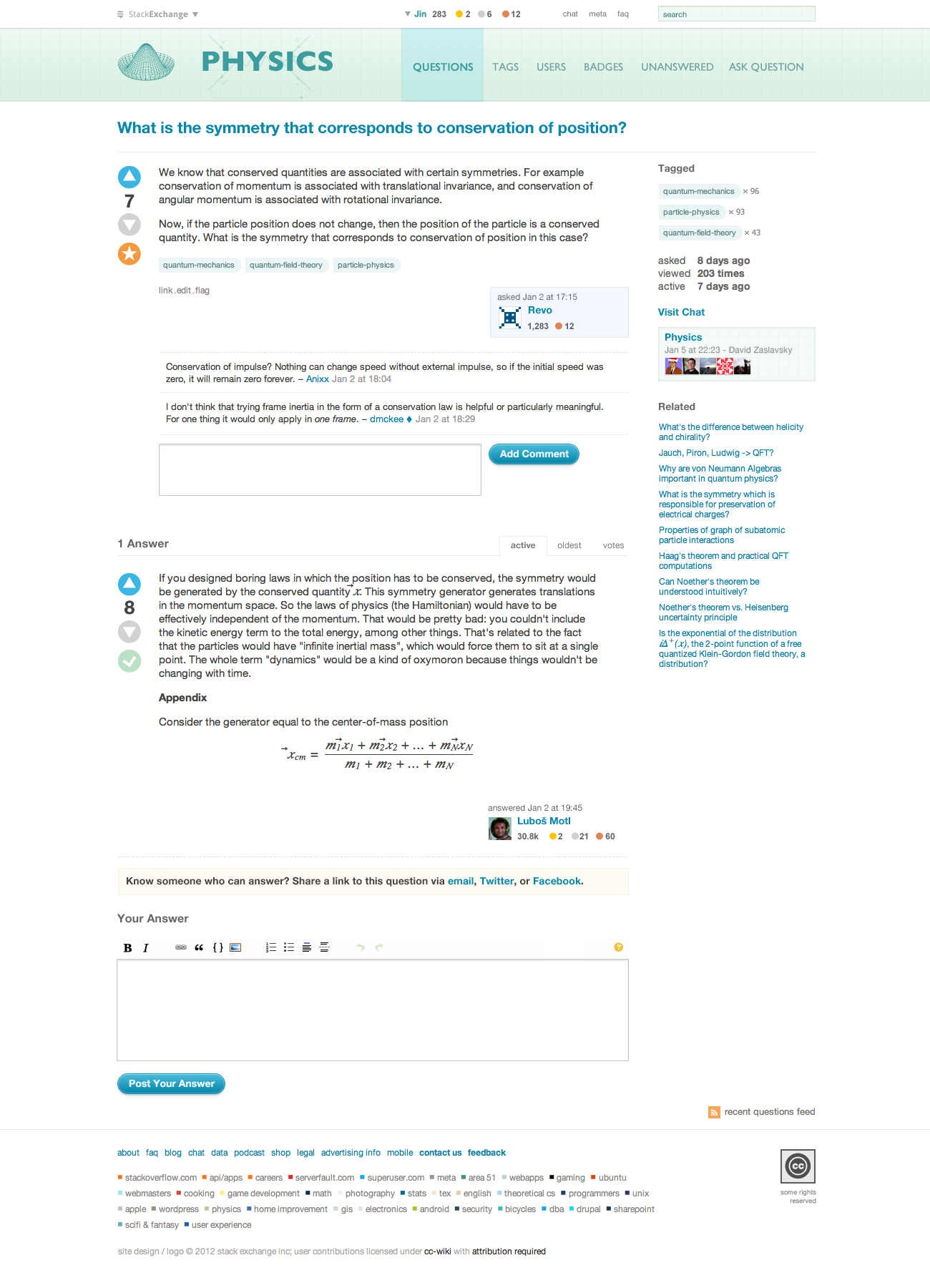
I'd like to present the community with a new final site design I've been working on. The goal is to keep the site clean and minimalistic, but at the same time give our physics site a unique branding. I gave the layout some extra spacing and line height for readability, also the colors have been tested for color blindness. I apologize for the first design, I learned my lesson the hard way!

Below are the mockups, please click on the images to see full resolution versions.

Home Page

Physics Homepage

Question Page

Physics Question page

If the community approves this design, I'll be converting it to CSS and hopefully launch the design next week. Also, I'll be creating top user swag (T-Shirt and stickers) and moderator cards soon. Below is a mockup of the shirt.
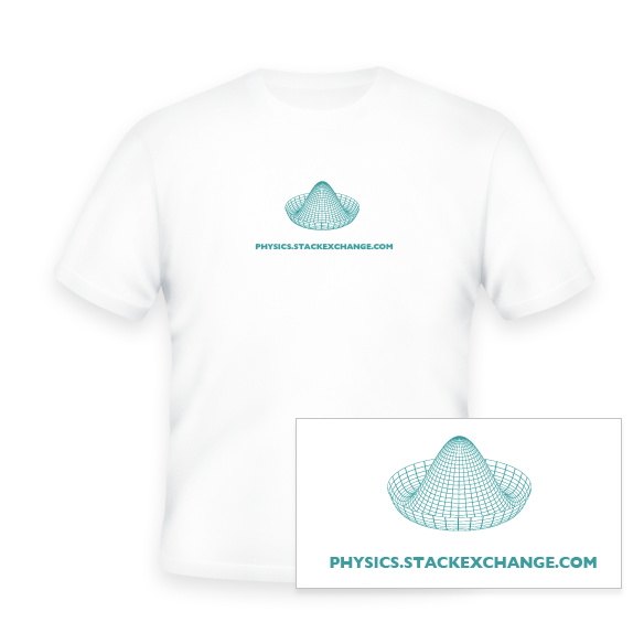
Physics T-Shirt

Please let me know what you think!

$\endgroup$
7
  • 4
    $\begingroup$ As a quick first impression, it looks fantastic! Thanks a lot, Jin! $\endgroup$
    – David Z Mod
    Commented Jan 11, 2012 at 18:47
  • 2
    $\begingroup$ I want a T-shirt :-) ! $\endgroup$
    – Dilaton
    Commented Jan 11, 2012 at 20:56
  • $\begingroup$ Stickerssssss~! $\endgroup$
    – Aarthi Staff
    Commented Jan 11, 2012 at 21:25
  • $\begingroup$ Oh well - nowhere near enough rep to qualify for a T-shirt :( $\endgroup$
    – ChrisF
    Commented Jan 13, 2012 at 12:51
  • 4
    $\begingroup$ Looks great, but could do with having a vote on alternatives for the Higgs Mexican hat graphic which might look too basic to some. $\endgroup$ Commented Jan 15, 2012 at 3:10
  • $\begingroup$ Awesome job! And thanks for giving us a second shot! (Also, I'd want that T-shirt...) $\endgroup$ Commented Jan 19, 2012 at 13:37
  • $\begingroup$ @Jin Can we have a candle on our logo? $\endgroup$ Commented Feb 24, 2012 at 11:43

6 Answers 6

6
$\begingroup$

As far as I'm concerned, the contrast of the main page is far to low. Why not make the titles of the question a little darker?

$\endgroup$
2
  • $\begingroup$ Another problem I have with the “accept“ button is that it looks like it is not activated since the saturation is so low. $\endgroup$ Commented Feb 3, 2012 at 12:10
  • $\begingroup$ @queueoverflow: Well yeah, also I don't know if the tags on the main site work if one clicks them. Btw. the contrast now seems to be better then when I made that comment two weeks ago. $\endgroup$
    – Nikolaj-K
    Commented Feb 3, 2012 at 12:28
5
$\begingroup$

I've been thinking over this today, and yep, I still like it ;-) It reminds me that the first time through, there were a lot of suggestions about cute ways to work physics concepts and notation into the design, but I think we'll be better off with a design like this that just gets out of the way, so to speak.

Personally I'd be quite happy with the exact design you've posted screenshots of, but I do have a few speculative thoughts:

  • The page footer seems insufficiently distinguished from the rest of the page. Maybe it's just me, but I think it would be nice to have some visual indication that the main content of the page has ended and that you're now looking at a generic footer. What about putting the same grid and gradient you use in the header, or perhaps a faded version of it, as a background for the footer?
  • Same goes for the right sidebar; it seems insufficiently distinguished from the main content of the page, though more so on the question list than the individual question page. Of course I'm not suggesting using the grid/gradient background for the sidebar, but perhaps there's something subtle that could be done there, like giving it a faint left border, or a slightly off-white background color, or fading the text, or whatever tricks you have up your sleeve for this sort of thing ;-)
  • Regarding the vertical alignment of the text of the site name and the page tabs on the right (questions, tags, etc.): when I look at it closely I do see that the baselines are aligned, but if I'm not focusing on that alignment specifically, it qualitatively seems just a little off. I'm wondering what it would look like if the names of those tabs were raised up by just a couple of pixels.
  • The tags also seem to blend into the background a bit. What would you think about putting a thin border of a marginally darker shade on the left side of each tag?

Also, do we get a custom image on the 404 page? That's one place I think we could get away with having some cute physics joke.

$\endgroup$
4
  • $\begingroup$ I can certainly do something with the footer, I think a faded gird may be good. as for the side bar, I think a thin line works. We use that treatment on our UX site. for the alignment, I'll be sure to tweak that and the tag styling in the actual CSS implementation. I don't have any ideas for 404/captcha/error page images, maybe it's a good idea to start a new post to gather some ideas? $\endgroup$
    – Jin
    Commented Jan 12, 2012 at 4:52
  • 1
    $\begingroup$ There were a few ideas for a 404 page proposed on the original design thread, but it certainly wouldn't hurt to take another crack at it. I posted a question for it and we'll see what ideas come up. $\endgroup$
    – David Z Mod
    Commented Jan 12, 2012 at 6:10
  • $\begingroup$ I love the redesign. It is very clean and visually appealing. I have one fairly subtle point: shouldn't the Feynman diagram behind "Physics" be rotated 90 degrees? To connote that we are meeting in one place to exchange information? $\endgroup$
    – Jen
    Commented Jan 17, 2012 at 18:10
  • $\begingroup$ Ahh, sneaky @Jen ;-) There's an arrow below it indicating that time increases to the right, though. $\endgroup$
    – David Z Mod
    Commented Jan 18, 2012 at 5:52
4
$\begingroup$

Elegant and visually pleasing, but as David notes it "gets out of the way" -- absolutely perfect for the site. On the other hand could we restart the search for a proper logo? I actually like the mexican hat favicon, but for the main image it's just a bit... lacking. Maybe it's just me.

$\endgroup$
3
$\begingroup$

I think that the meta color scheme is better and I'd rather see that as the main site design. Then it would be about perfect.

Just my 2 cents! Good job getting this done. Any design is better than the standard one.

$\endgroup$
3
  • 1
    $\begingroup$ Yes, the meta scheme struck me as having a more subtle elegance about it. I'd also prefer this for the main page, but with the gold text replaced by either black, some shade of grey, or a subtle colour that blends with the neutral text, rather than screaming out for attention as in the case of the current gold colour. $\endgroup$ Commented Jan 18, 2012 at 17:44
  • $\begingroup$ It is a common convention across the network that meta sites' color schemes are "grayed-out" versions of their main sites' color schemes. If we put the meta site scheme on the main site, I'm not sure what could be done to make it more gray ;-) (Also, personally I do just prefer the main site color scheme, but that's me) $\endgroup$
    – David Z Mod
    Commented Jan 19, 2012 at 17:32
  • $\begingroup$ It's taken some time, but it has grown on me - both color schemes. $\endgroup$ Commented Feb 6, 2012 at 3:23
2
$\begingroup$

Good job! Overall I love the clean look of the new design, the color scheme, all of it. The only criticism I have is that the color on meta seem to have lower contrast now, specifically the light brown text. This makes it a little difficult (though not impossible!) for older eyes like mine to view the site with comfort.

$\endgroup$
2
  • 1
    $\begingroup$ Mark are you referring to the link color on Meta? $\endgroup$
    – Jin
    Commented Jan 18, 2012 at 2:09
  • $\begingroup$ oh, you're right! It is just the color on Meta. the main site colors are fine. $\endgroup$ Commented Jan 18, 2012 at 2:13
2
$\begingroup$

I am a bit confused. At present I see a changed current format already. In this one my only comment is that the yellow/gold used for links and names is too faint for my laptop screen . The faded feeling does not attract clicking.

The mock up gives better contrast to the yellow and is fine as it uses little yellow/gold (none?).

$\endgroup$
2
  • $\begingroup$ Are you looking at meta or the main site? $\endgroup$
    – David Z Mod
    Commented Jan 19, 2012 at 17:30
  • $\begingroup$ the main site.But today it is only the meta side line that is gold, and that is fine. If I change the angle of the lap top screen it gets better contrast. $\endgroup$
    – anna v
    Commented Jan 19, 2012 at 20:01

You must log in to answer this question.

Not the answer you're looking for? Browse other questions tagged .