Hi all. I'm Jin, and I'll be working on the designs for the Stack Exchange sites as they graduate from the beta phase. Each site will have its own unique theme that will reflect its topic. However, all sites will share quite a bit of common elements so they feel like they're part of the Stack Exchange family.
I'd like to thank you for creating a thread on design ideas. It's helped me a great deal. After reading through all the suggestions, and researching on my own, I feel a blackboard theme would work well. It conveys a strong academic theme and has a personal touch, it also gives this community a distinctive character and identity. For those who are still in school learning and teaching, this theme creates a similar setting. For those outside of academia, it strikes a nostalgic feeling.

Of course, creating a dark themed design is always tricky. Bright text on flat black is harsh. But I believe when done right, a dark theme can be beautiful and sophisticated.
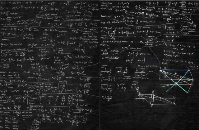
I'm inspired by the above black board photo I found, as well as some photos submitted in the other thread.
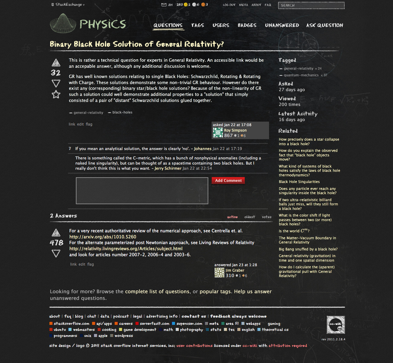
The design goal is to mimic the blackboard theme. It will have physics equations serving as visual decoration, but subtly so as to not get in the way of the main content. It needs to be simple and relatable to the site's audience.
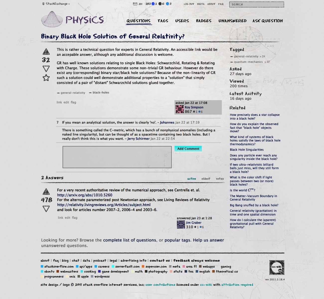
Here are the design concepts. (click on image to see full resolution versions)
The faint grunge texture in the background is there to add to the blackboard effect. I've used some suggested equations/figures from the other thread as decorations, again, subtly. For the logo, I'm using the Mexican Hat. I think a geometric figure works well in the allotted space.
The equations I used are: Feynman diagram, Maxwell's equation, Heliocentric coordinate system for Kepler's laws of planetary motion, and Electronic properties of graphene. Of course, you are the physics experts, please let me know if I made any mistakes representing them. Also, if you feel there are certain equations that should be included to better serve the site(to reflect the level of questions), let me know. But do keep in mind, these equations are for decorative purpose only. I certainly don't want the entire background to be full of ghost marks. It would be hard to read the real content.
For the tag treatment, I'm keeping it simple. I believe a straightforward "—" feels more natural to how you'd write tags on a blackboard.
I'm keeping the number of colors very limited for this theme. They resemble traditional chalk colors: white, yellow and red(pink).
I believe this design works for the goal intended. The dark theme really makes this site stand out, and the important content is easier to read.
Please let me know your thoughts.
I'm hoping to get the site launched very soon. So an early congrats from me!


