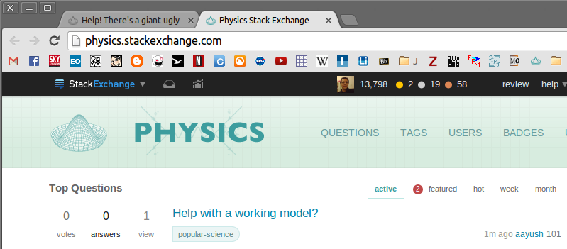
As you probably noticed, there is a new top bar implemented on this site. This is part of a network-wide experiment in... UI design I guess? Details on
I'm not complaining about or complimenting the way the features are implemented (not here, anyway - you can always check out Mother Meta), but I request that the color scheme be changed. The current off-black clashes quite harshly with our light-blues-on-white scheme. It looks like some sinister cloud, ever reminding us of our network overlords' presence.
The current color may work well on certain sites, but certainly not all. This is not surprising, because no one color scheme could possibly work on dozens of individual sites with their own customized appearance.
By the way, we're not the only site that seems to have a clash. Just check out Christianity, Mathematica, Mathematics, Mi Yodeya, Programmers, and TeX, for example. (As I'm not a particularly active member of any other site, I'm not formally requesting those sites be changed, which is why I'm not asking on Mother Meta. Also, there is at least one such global request: Would it be possible to lighten the color of the new top bar?)
So can we get something that fits our color scheme, please? And no, saying I should userscript it is not a valid answer - I'm considering how the site looks to everyone else too.

